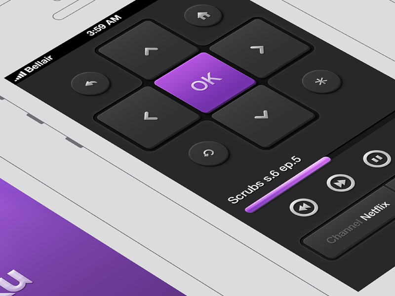
First part of the Roku remote redesign I've been working on for fun lately.
It includes the splash screen, remote screen and playlist overlay.
If you're familiar with the current remote, you'll notice that I merged the channel selector and the store directly into the remote to set it as the main screen and remove bottom navigation.
Some features like channel playlist may not be possible to do but it's more a concept than anything else.
------
Resources used
iPhone 5 wireframe by Daryl Ginn
Most of the icons are from this great pack from Victor Erixon
------