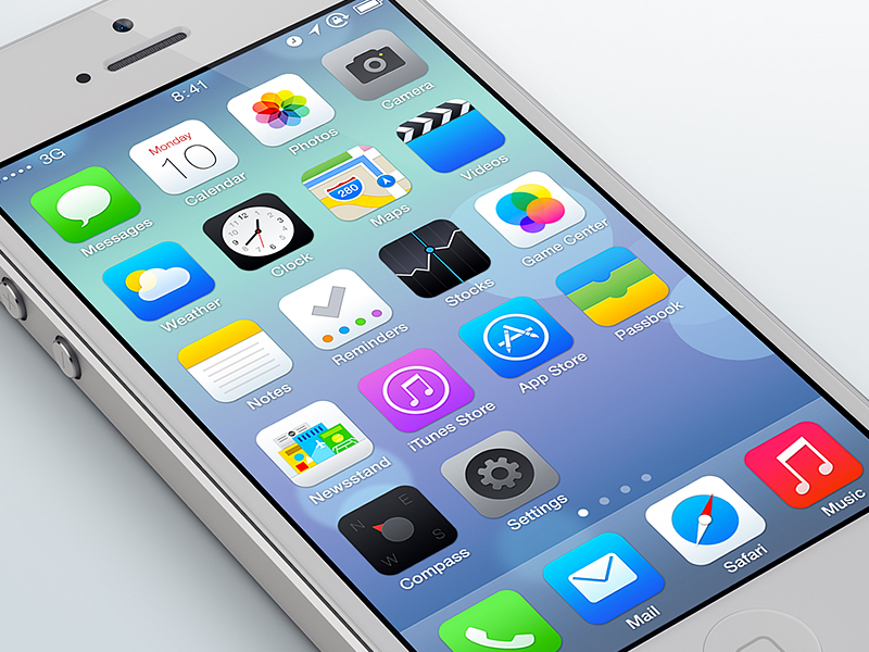
I know. Expected. But I just couldn't resist redesigning the icons and the Home Screen UI of this newly launched iOS 7 beta.
So, I kept the same design direction, the overall look and fresh feel to it, but trying to make it look more detailed, coordinated and just cleaner. Also, I kept the old iOS border radius for the icons (the new standard doesn't feel right to me), and also the old items on the right of the status bar.
Edit : Thanks everyone ! It's actually my first real "popular" shot on Dribbble (at least at this level :p). So I try to take time to read all the comments and get some advices on how to improve this redesign. I updated the speech bubble tail on the Messages icon (which now looks proper) and also the Compass icon (now closer to the original one, but simpler and refined).
Final Edit : So, I replaced the previous attached files by the 4 final ones. It includes all the little changes and improvements that some of you suggested, or that I wanted to bring.
What's new : the Clock is corrected, there is now a dark/light variant, the shadows behind the icons and labels are gone (cleaner look, like the original iOS 7 beta), and some improvements on the details of the Stock, Compass and Mail icons.
Cheers.